Brand New: Nivea Gets Rid of its Own Wrinkles.
Nivea Gets Rid of its Own Wrinkles
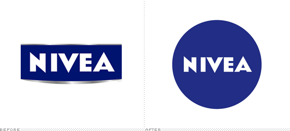
First produced in 1882 in Germany by pharmacist Carl Paul Beiersdorf, Nivea is today one of the leading skincare products in the world owned by Beiersdorf AG (which also owns Elastoplast, Eucerin, Labello, and La prairie). Nivea’s most well-known product is its original Nivea Crème which was first packaged in the iconic blue tin in 1925 and now serves as the basis for the “new global design language” introduced by Nivea this week, designed by San Francisco-based fuseproject.
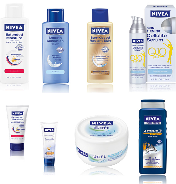
Sample of existing products and their packaging.
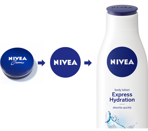
The blue tin has embodied NIVEA’s brand values since 1925. It is the brand “face” that consumers around the world associate with trust, closeness and expertise. Now Beiersdorf AG has introduced a new global design language based on the iconic blue tin. The new design consistently translates the successful NIVEA brand’s values into a product that consumers can see and feel, thereby making products in all categories immediately recognizable. Beiersdorf has consistently developed the NIVEA brand with a focus on its global core values. The gradual introduction of the new design for the entire NIVEA skin and body care portfolio will commence in more than 200 countries in January 2013.
— Press Release
Although a circle version of the logo has been used before, and is currently what’s on the Nivea website, it is not officially the sole logo: Try a Google Image Search for Nivea logo and wince in pain. On its current range of products the Nivea wordmark is delivered in a rectangle with an unflattering curve with cheap gradients hanging from the bottom. The idea of establishing a single logo is not just good but much needed. Basing it on the iconic tin can is the perfect rallying cry for the company to adopt it and stick with it. It’s unfortunate that the kerning wasn’t fixed, you can put a whole body lotion bottle between the “NI” pair. It’s a tricky word to kern, but surely it can be done.

Sketches and prototypes.
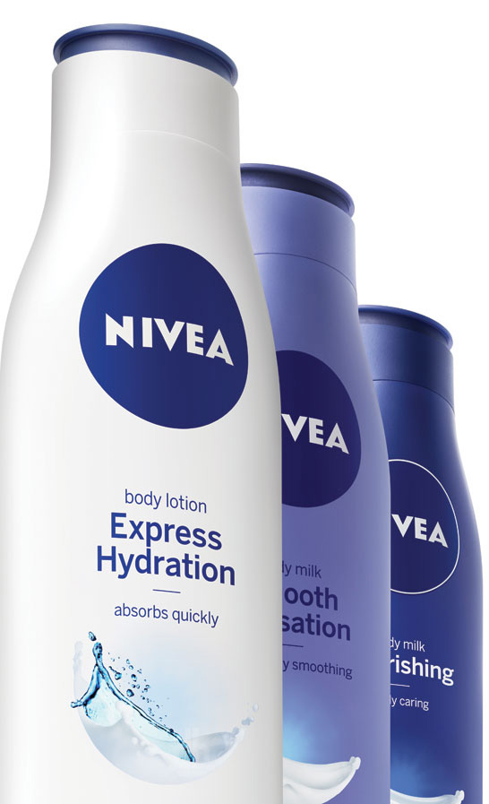
Sample of new packaging.
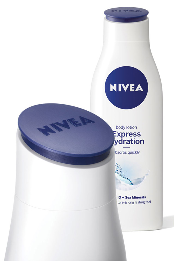
Detail of tilted and logo-embossed cap.
The blue NIVEA tin wasn’t just the basis of the design, but also a source of inspiration to the designers. The crème tin is used as a logo, reflected in the rounded contours of the new packagings and in the reduced blue and white colors of the new design. The round lid, which tilts towards the consumer, embossed with the NIVEA logo, has obvious similarities with the iconic blue tin and it provides customers with a “familiar face” on the shelf.
— Press Release
The new packaging looks great. The bottles look softer and friendlier and the tilted cap is a fun example of user friendliness in the real (physical) world. It does look like they are keeping the creme/droplet motif from the old packaging but rendered in a new way. It’s totally goofy but most mainstream packaging is, so it fits well. Overall, I love me a good standardization and simplification exercise that builds on existing equity at a global scale.
Yves Béhar on the development of the new packaging.
PROJECT SPOTTED AT THE BRANDING SOURCE AND MOST IMAGES SOURCED FROMDESIGN BOOM.
