Looking to grab your audience’s attention at once? Regardless of whether you’re announcing an event or promoting a cause, good flyer designs can help you achieve your goal.
Of course, not even the best flyers are not readers’ favorite memorabilia, and will most probably end up somewhere in the trash, but if your flyer ideas were good, you’ll have accomplished your mission by that moment: readers will already know what you were trying to tell them!
As a result, they may go for what you invited them to do, especially if you captured them with a cool and modern flyer.
One rule remains the same: If you know how to design a flyer, or have been looking for flyer design inspiration in the right place, you’ll certainly manage to excite people about your product, service, or event.
Creative flyers include artwork that matters the most to their effectiveness, but so do printing and general design considerations (colors, fonts, images, and so on).
How to make a good flyer? To simplify this process for you, we’ve gathered some of the best flyer examples and critical design steps:
Plan and arrange content in advance

Image source: Digital Space
One of the key stages of event flyer design is to plan and organize information. In order to do that, you have to ask yourself which your goals are, and which the key message you want to convey is.
Cool flyers need to share information in an attractive and limited manner, to say at least, as for instance the venue and performer of a concert, and the price of the tickets.

Image source: Guillaume Kashima
Obviously, the amount of information available on the slide will depend on the real estate you have available, but even with a large pamphlet, try to eliminate the content you’re including.
The same as in other design branches less is more and you shouldn’t expect large and overwhelming chunks to make people understand your invitation or be excited about it.
As practice shows, the most successful flyers are the ones where information is adopted in half of a second, which puts you in front of some serious sorting and decision making.
The secret is a simple one: Include only the information you think is essential, and organize it in chunks that are easy to digest.
Function matters more than form

Image source: Steve Goodin
It is easy to get distracted by fun and entertaining ideas, but the truth is flyers can’t and won’t be a Michelangelo masterpiece. In reality, they are visually attractive informative means, and the worst possible way to create one is to leave information in the shadows of beautiful decorations.
The niche doesn’t matter – both night club flyers and computer sales ones are created with a purpose, which is why you should limit appearance to a catchy piece that will make users look at it and wish to attend the event.

Image source: Elena Savitskaya
Technically speaking, you must prioritize function to form, and always move in the direction of uncompromised usability. You should ‘push the right buttons’ for people should see what you want them to see, and that’s something successful retailers know very well.
Adjust design for smaller surfaces

Image source: Hilen Godoy
As you can already imagine, the biggest challenge for your graphic designer will be to work on a limited print space, and still assemble all information you wish to display. In their original form, most flyers are made on a standard A5 or A6 format (148 x 210 mm or 105 x 148 mm), and require designers to be extremely creative to maximize their potential.
Both in the case of formal brochures and informal invitations, a smart practice is to extract the most important text, and then arrange it in a single row/column to have more space for creative grid experiments. For more official announcements, think of rigid, newspaper-style arrangement in same-size columns.
Dullness is out of the question

Image source: Kawaii Universe Studio
As irrelevant as an event may be, you can’t afford yourself the luxury to advertise in a dull and uninterested way. If you seek attention, be it for a neighbor reunion or a fancy exhibition, being dull is out of the question.
The flyer must ‘spread’ some of the event’s magic on viewers, so that they would immediately imagine themselves there, or wish to be a part of it. This is particularly important for events that generally don’t attract too much attention, where a flyer can help invoke the party spirit and make people attend it.
Here are some basic tips that can make your flyer design more exciting:
You Must Work With Colors – Your choice of complementary palettes should consist mostly of warm and bold shades, including sunny yellows and hot pinks, with a colder backdrop to catch the eye and conjure a memory of a hot summer day spent in the nature (BBQ events and festivals benefit amazingly from these ideas).
If you intend to add a sporty and masculine edge, choose darker tones as the main players, or stick to the safe black-and-white concept.
Balance Bold Elements In A Trio – Team up the amazing photo you’ve decided to use with a colored element (interesting patterns, action buttons, and so on), and an attention-grabbing header. Don’t include any other bold element because you can overwhelm viewers, and turn your eye candy into an eyesore.
Add Some Fun And Optimism – Regardless of what you’re announcing, make sure the flyer is not overly serious, because it is exactly childish and witty elements that attract the most attention.
Your ultimate goal is for people to pick up the flyer and to read it, and you won’t achieve that with a black paper with few lines of text. At the end of the day, people are looking for something that will make them feel good and optimistic.
Think of what makes your flyer better than the rest

Image source: Jonathan Moreira
Your flyer design must have at least one distinctive advantage. In order to understand how this works, think of an everyday example – you’ve headed to work, but stopped by a close bar to pick up a coffee.
You’re just about to pay for the purchase when something grabs your attention: all of a sudden, you see an announcement of a 2-days sale in your favorite mall pinned to the bar’s bulletin table, and despite of the fact that you have no time to finish your coffee, you keep looking at the flyer and can’t get moving.
Most likely, it is an attractive visual element embedded on that flyer that made you think of it. Some designers work their way with catchy fonts; others use beautiful images and rely on striking color contrasts. In short, the final product is both charming and compelling.
Before we’ve moved any further, try to remember that a flyer is not a way to express your creativity, but a form of advertisement that must correspond to what common viewers describe as creativity. The main purpose for each flyer is to attract attention, as if it doesn’t do this, it won’t do anything else.
For a memorable flyer design, ensure you’ve got:
A focal point/element that is not cluttered

Image source: Joris Rigerl
There is a focal point in every design, and that’s the main part of the layout where viewers direct their attention.
It can be the font, the image, the headline, or the background color – whatever it is, it will be the first thing a person will pay attention to. Because of this, you must keep all clutter off your focal point, so that viewers would immediately understand what you’re trying to tell them.
Images that explain

Image source: Dave
Images are quite common on all types of flyers, and that’s because visual messages are easier to ‘digest’ than textual ones’. You can either use a basic photo, or a multifaceted one on the background, but make sure it helps viewers understand the content.
Fonts that are suitable

Image source: Corinne Alexandra
Many designers neglect the importance of typography in flyer creation, but the truth is that fonts matter just as much as images do. They sort of reveal the ‘character’ of your events, and support the theme and the purpose of your flyers.
Direct calls to action
Once you’ve handled choice of colors, imagery, and copywriting, it is time to complete your work making a direct request for viewers. In most cases, it comes down to the simplest marketing concept of trying-and-testing, which basically refers to you popping the question right below the informative part.
If you expect viewers to do something related to the event, ask them to. Believe it or not, people respond positively to this type of requests, because they like feeling involved, and being an active part of what is going on.
In most cases, you can achieve this with simple sentences such as ‘Visit us today’, or ‘Like us on Facebook’. Making friends, as usual, is not rocket science.
Get inspired
Nowadays, when there are millions of media organizations and individuals competing for attention, turning eyeballs on your side has become a daunting challenge. You need to design a flyer that has never been seen before, but still comply with some basic rules without which people would surpass it.
The truth is that you need to be extra creative to stand out of the crowd, because everything else than the best may end up in the recycle bin. If you run a business, or are organizing a fundraising for your community, this is the last thing you want.
Here are some very interesting examples that can help you prepare your new project:
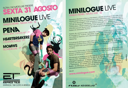
Minilogue Flyer
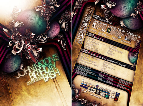
JOHN MOON’S FLYER
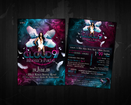
Cloud 9 Heaven’s Portal
SWP Beach Party 08 flyer
Philippe’s B-Day Flyer
BLVD-Nights Flyer
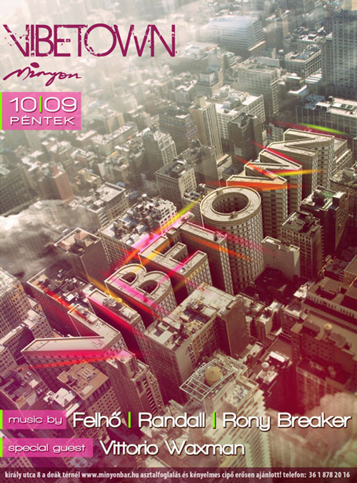
Vibetown Flyer 2
Randall Flagg Show Flyer 2-25
House flyer
Emigration Flyer
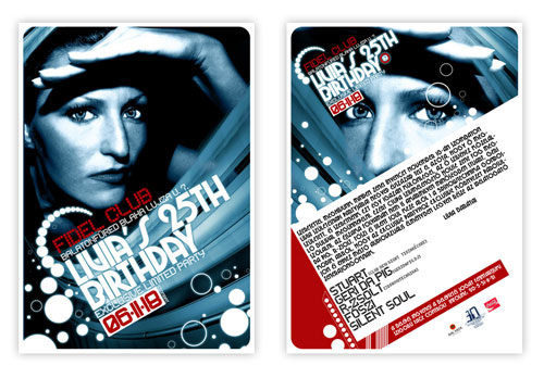
Fidel Club Flyer
Connection Flyer
Another flyer
Rausch Flyer
Halloween flyer
Talk Is Cheap Flyer

Dancenight Mit Dj Edge

Flyer Electro Night
Stel + Kosmas Epsilon Flyer
PartyOn Flyer
Attitude flyer 2
Party Flyer -PSD-
Sexy Black Party Flyer
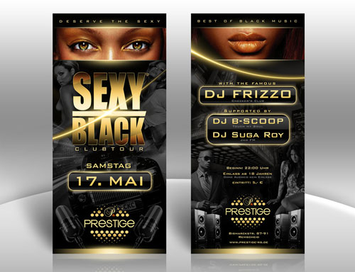
School PROM FLYER
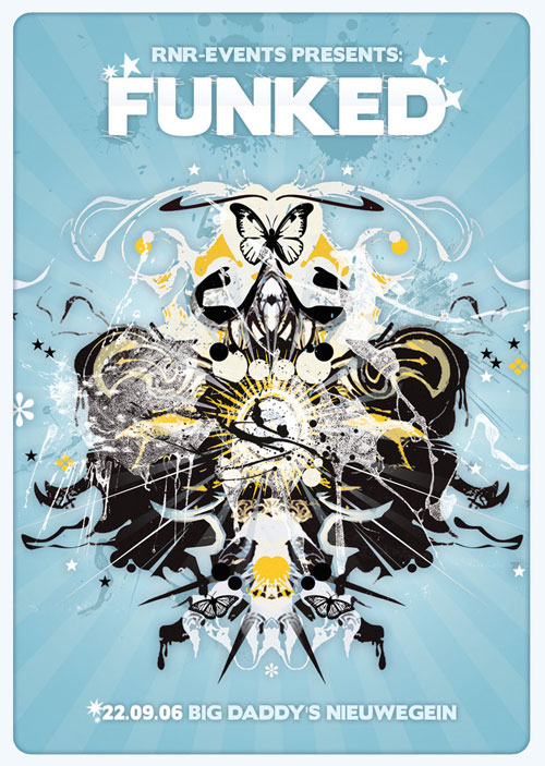
Funked Flyer
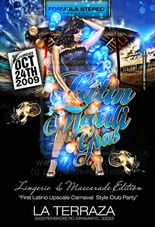
Latin Mardi Gras flyer Party
Touch my soul Flyer
The Black Panther Party
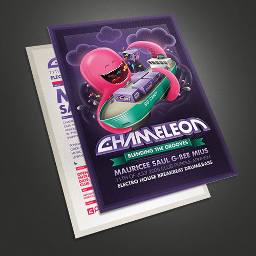
Chameleon – Octopus flyer
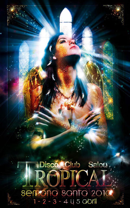
Disco Club Tropical Flyer
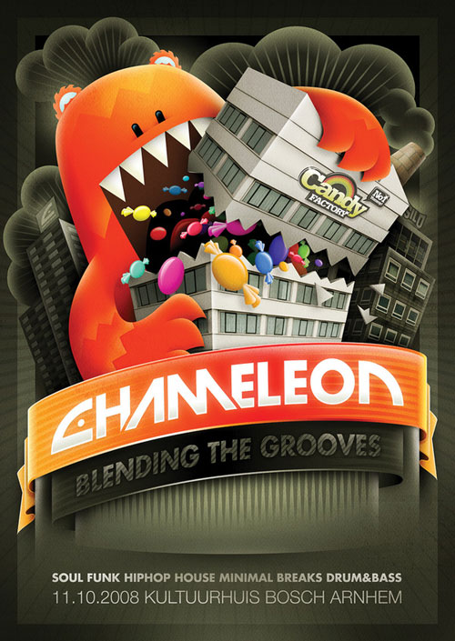
Chameleon – Candy factory flyer
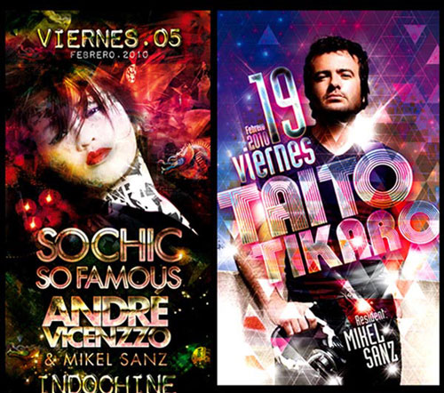
Flyers selection 1
Beach Party Flyer
Flyer aelaat studio

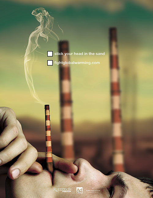
Fight Global Warming Flyer
Fonte: How to make a good flyer – modern flyer design inspiration

