
And Partners Make Seven
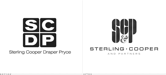
Established in 1968, Sterling Cooper & Partners (SC&P) is one of the leading advertising agencies in New York, NY and is the result of a merger between Sterling Cooper Draper Pryce (est. 1963) and previous competitor Cutler Gleason and Chaough. SC&P’s current list of clients includes Chevrolet, Mohawk Airlines, Manischevitz Wines, and Ocean Spray and Sunkist (which is a conflict of interests). When first merged, the agency attempted to adopt Sterling Cooper Draper Pryce Cutler Gleason and Chaough as a name and SCDPPCG as an acronym but soon after settled on the name Sterling Cooper & Partners honoring the original partners, Bertram Cooper and Roger Sterling Sr. (current Roger Sterling’s daddy), who had founded the Sterling Cooper Advertising Agency in 1923. Yesterday, the agency introduced its new logo through a press release issued for immediate release. No design credit was given.
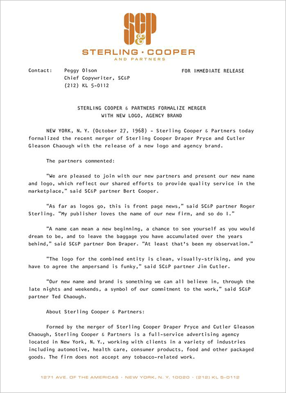
Press release.
![]()
Logo detail.
The previous logo worked nicely in that it was four letters neatly arranged in a tight grid of rounded-corner squares but in order to make all the letters fill out the squares the typography has been stretched, making the “S” and “C” particularly aggravating. I will blame it on the nascent technology of phototypesetting that allows far more play with the fonts than ever before. But the agency should know better than letting technology drive their aesthetics. Five years makes a big difference and the SCDP logo — name change notwithstanding — was starting to feel out of date in this drastically changing decade. The new logo drops the seriousness of its predecessor with a custom monogram of the abstracted initials and an ornamental ampersand. The monogram letters are nicely executed with the same proportions and counter-spacing used in the taller letters (“S” and “P”) as in the shorter one (“C”). The supporting wordmark comes in a remarkably nice bulbed sans serif that hints back to the original sans serif but clearly points forward. Overall, I don’t know if this logo communicates all the ideals expressed by the partners in the press release but it is definitely a major improvement that establishes SC&P as an edgier and more contemporary agency.